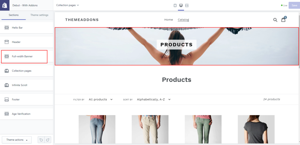
Shopify Full Width Banner uses it’s a Rich Text editor to give merchants the option of Full Width banner adding content to their pages. Whether a product, collection, blog post or just an about Shopify Banner Size page all follow the same flow and have the same formatting for that content. Full Width Banner on Shopify up into a more segmented flow takes code knowledge and modifications to the theme files which we understand not all store owners will be able to do.
Yes, size matters for the Full Width Banner on Shopify images. Have you ever wondered what grabs your attention when you visit an online store? You will observe the biggest and prettiest picture on the screen will grab your attention.
This is important to think about because many stores use a lot of product images to sell more and keep customers pleased. You want to use the greatest resolution image without sacrificing site quality; after all, if a site is slow, you can quickly lose customers. Full Width Banner on Shopify is the most important image on a website, Generally it’s the first image below the menu. Your Shopify Banner Size should be large enough to provide visitors an overview of your topic, especially if you use content overlay choices.
Editing your theme code to add this feature for Shopify Banner Size
Required files: section [full-banner.liquid];
- In the Section directory, Create a new file named
full-banner.liquidand add the following code:
{% if section.settings.enable_full_banner %}

    <div class="section--fullwidth-banner" id="section--fullwidth-banner" style="background-image: url('{{section.settings.img | img_url: 'master' }}')">
      <h2 class="title"><span> {{page_title}}</span></h2>
    </div>

  <style>
    .section--fullwidth-banner{
      position: relative;
      display: flex;
      align-items: center;
      width: 100%;
      height: {{section.settings.img_height}}px;
      overflow: visible;
      text-align: center;
      background-size: cover;
      background-repeat: no-repeat;
      background-position: 50% 50%;
    }
    .section--fullwidth-banner .title{

      z-index: 1;
      width: 100%;
      font-weight: 900;
      font-size: 170%;

    }
    .section--fullwidth-banner .title span{
      display: inline-block;
      padding: 10px 20px;
      background: rgba(255,255,255,0.8);
      color: #000;
    }
    {% comment %} .section--fullwidth-banner img{
      position: absolute;
      z-index: 0;
      top: 0;
      left: 0;
      right: 0;
    } {% endcomment %}

  </style>

{% endif %}

{% schema %}
  {
    "name": "Full-width Banner",
    "settings": [
      {
        "type": "checkbox",
        "id": "enable_full_banner",
        "label": "Enable Fullwidth Banner",
        "default": true
      },
      {
        "type": "image_picker",
        "id": "img",
        "label": "Default image"
      },
      {
        "type": "number",
        "id": "img_height",
        "label": "Image height in px",
            "default": 200
      }
    ]
  }

{% endschema %}

{% stylesheet %}
{% endstylesheet %}

{% javascript %}
{% endjavascript %}
- In the Layout directory, find
theme.liquidand locate{% section 'header' %}. Add the following code right after the{% section 'header' %}:
{%- if template contains 'page' or template contains 'collection' -%}
        {% section 'full-banner' %}
    {% endif %}
- Congrats, You’ve completed the coding parts.
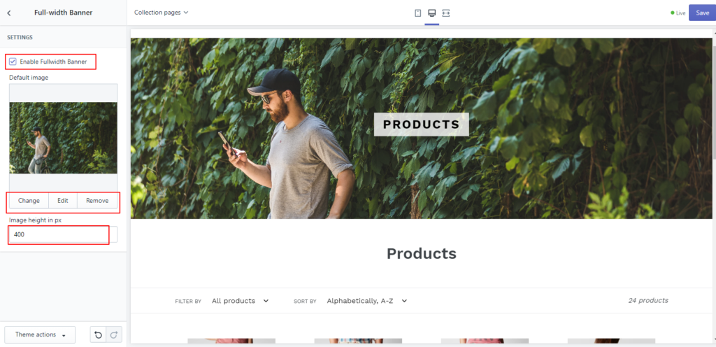
- Now you can see Shopify Banner Size any pages and collections. It’s enabled by default.
- Also, it’s available in Themes>Customize theme section where you could disable this feature or change the image


- It’s not available in the home or product page but you could configure this through theme.liquid file.


This is great, thank you. How would I disable the banner image for mobile devices and have it only displayed on desktop?