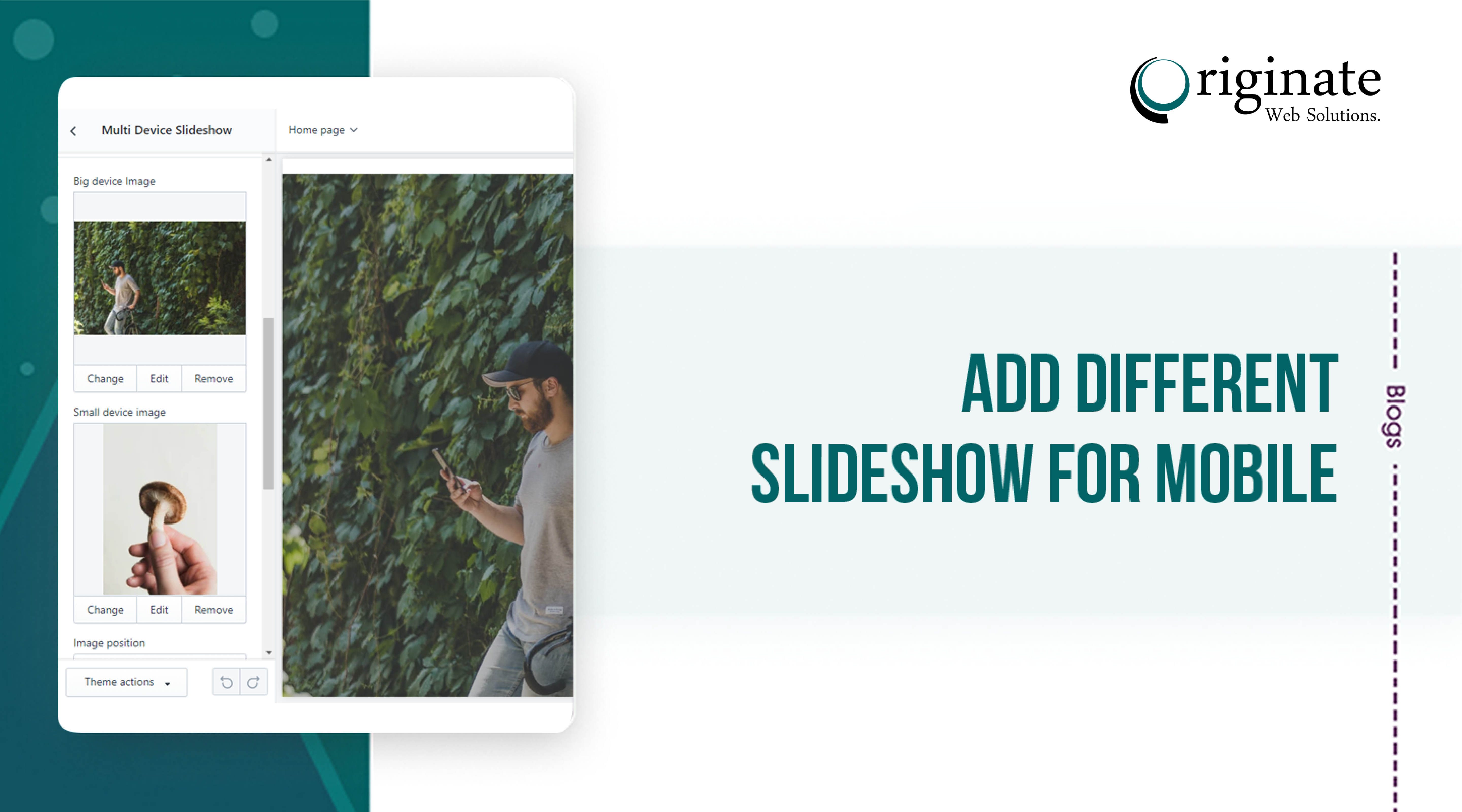
We’ve developed Shopify slideshow for mobile feature in the Debut theme and used the existing Slick slider. So we’ll walk through this tutorial expecting you’re using Debut theme. If you’re not using Debut then we have a different solution for that. We’ll discuss that after the Debut theme tutorial.
Editing your theme code to add this feature
Step 1: From your Shopify admin, go to Online Store > Themes.
Step2: Find the theme you want to edit, and then click Actions > Edit code
Step 3: Go to Sections > slideshow.liquid and find the following code into this file:
<div class="slideshow__media banner__media media">
    {%- if block.settings.image -%}
    {%- assign height = block.settings.image.width | divided_by: block.settings.image.aspect_ratio | round -%}
    {{ block.settings.image | image_url: width: 3840 | image_tag:
        loading: 'lazy',
        height: height,
        sizes: "100vw",
        widths: '375, 550, 750, 1100, 1500, 1780, 2000, 3000, 3840'
    }}
    {%- else -%}
    {{ 'lifestyle-2' | placeholder_svg_tag: 'placeholder-svg' }}
    {%- endif -%}
</div>
- Step 4: Replace with this following code:
<div class="slideshow__media banner__media media{% if block.settings.image == blank %} placeholder{% elsif block.settings.image != blank and block.settings.mb_image == blank %} show-desktop-image{% else %} desktop-img{% endif %}">
    {%- if block.settings.image -%}
    {%- assign height = block.settings.image.width | divided_by: block.settings.image.aspect_ratio | round -%}
    {{ block.settings.image | image_url: width: 3840 | image_tag:
        loading: 'lazy',
        height: height,
        sizes: "100vw",
        widths: '375, 550, 750, 1100, 1500, 1780, 2000, 3000, 3840'
    }}
    {%- else -%}
    {{ 'lifestyle-2' | placeholder_svg_tag: 'placeholder-svg' }}
    {%- endif -%}
</div>
Step 5: After the above mentioned code added please add one more slideshow code for mobile:
<div class="slideshow__media banner__media media{% if block.settings.mb_image != blank %} mb-img{% endif %}">
    {%- if block.settings.mb_image -%}
    {%- assign height = block.settings.mb_image.width | divided_by: block.settings.mb_image.aspect_ratio | round -%}
    {{ block.settings.mb_image | image_url: width: 3840 | image_tag:
        loading: 'lazy',
        height: height,
        sizes: "100vw",
        widths: '375, 550, 750, 1100, 1500, 1780, 2000, 3000, 3840'
    }}
    {%- endif -%}
</div>
Step 6: Now we can go to schema settings and add the schema settings for mobile image in the blocks:
{
    "type": "image_picker",
    "id": "mb_image",
    "label": "t:sections.slideshow.blocks.slide.settings.mb_image.label"
},
Step 7: After added schema we need to go to Locales > en.default.schema.json file and add the following code in the slideshow section in this json file under blocks:
"mb_image": {
    "label": "Mobile Image"
},
Step 8: Now we need to add css code into assets > component-slideshow.css at the bottom of css file to show mobile image and hide desktop image:
/* Show Mobile image on mobile screen and desktop image on desktop screen styles start */

.media.desktop-img{
  display: block;
}

.media.mb-img{
  display: none;
}

@media (max-width: 750px){
  .media.desktop-img{
    display: none;
  }

  .media.mb-img{
    display: block;
  }
}

/* Show Mobile image on mobile screen and desktop image on desktop screen styles end */
Step 9: Click Save and you are done.
Coding part is done.
Now you can go to the slideshow section on customization and add mobile images.
Thanks
Now we’ll walkthrough for a different theme
- In the Layout directory, open the
theme.liquidand find the ending</head>tag and add the following slick slider cdn right above the</head>tag:
https://cdnjs.cloudflare.com/ajax/libs/slick-carousel/1.9.0/slick.js
https://cdnjs.cloudflare.com/ajax/libs/slick-carousel/1.9.0/slick.min.js
- Asset directory, open the theme.scss.liquid and add the following code at the bottom of the file from here here or you can add CSS CDN from here. If you want to use the CDN then you have to Shopify slideshow for mobile put the CDN link to the Layout>theme.liquid file before the
</head>tag. - In the Sections directory, create a new file and name it whatever you want and add the following code from here.
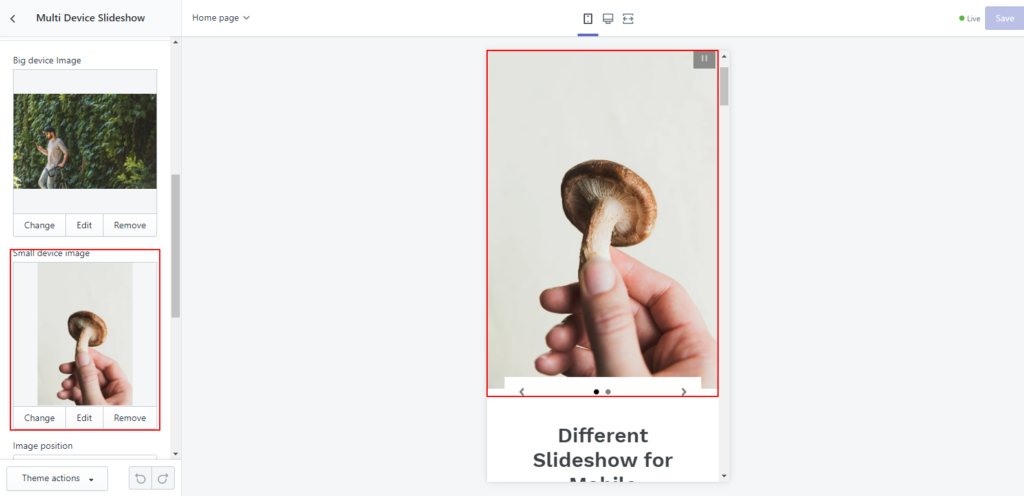
- Congrats you’ve completed the coding part. Now it’s available in the Themes>Customize>add section> Multi device Shopify slideshow for mobile. Now you can add two images, one for the big device and another for small devices
Hi,
I´ve successfully added the “specific-device-slideshow.liquid” in the “Sections” of the Debut theme. The section “Multi Device Slideshow” can be selected in the Theme Editor and I can add the “Big device image” and “Small device image” just as in the screenshot above.
But after saving any desktop browser up to 4K resolution only displays the small device image. Any idea how I can debug or fix this?
Thanks!
You’re missing the CSS Styles.
@media (max-width:749px){
.multi-slideshow-wrapper .desktop-image{
display:none;
}
}
@media (min-width:750px){
.multi-slideshow-wrapper .mobile-image{
display:none;
}
}